 CHILDREN CHIU


Background
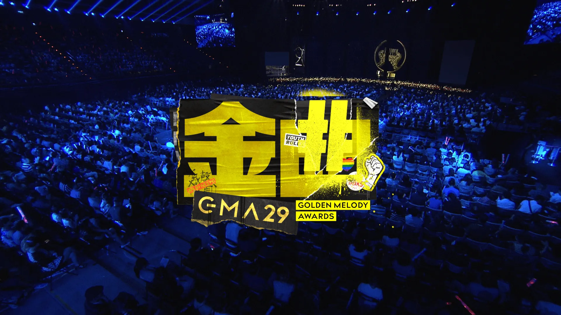
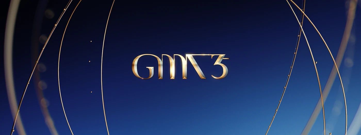
The Golden Melody Awards—Asia’s biggest Chinese-language music awards and often called the “Grammy Awards of Asia”, which is a landmark event in the music industry.
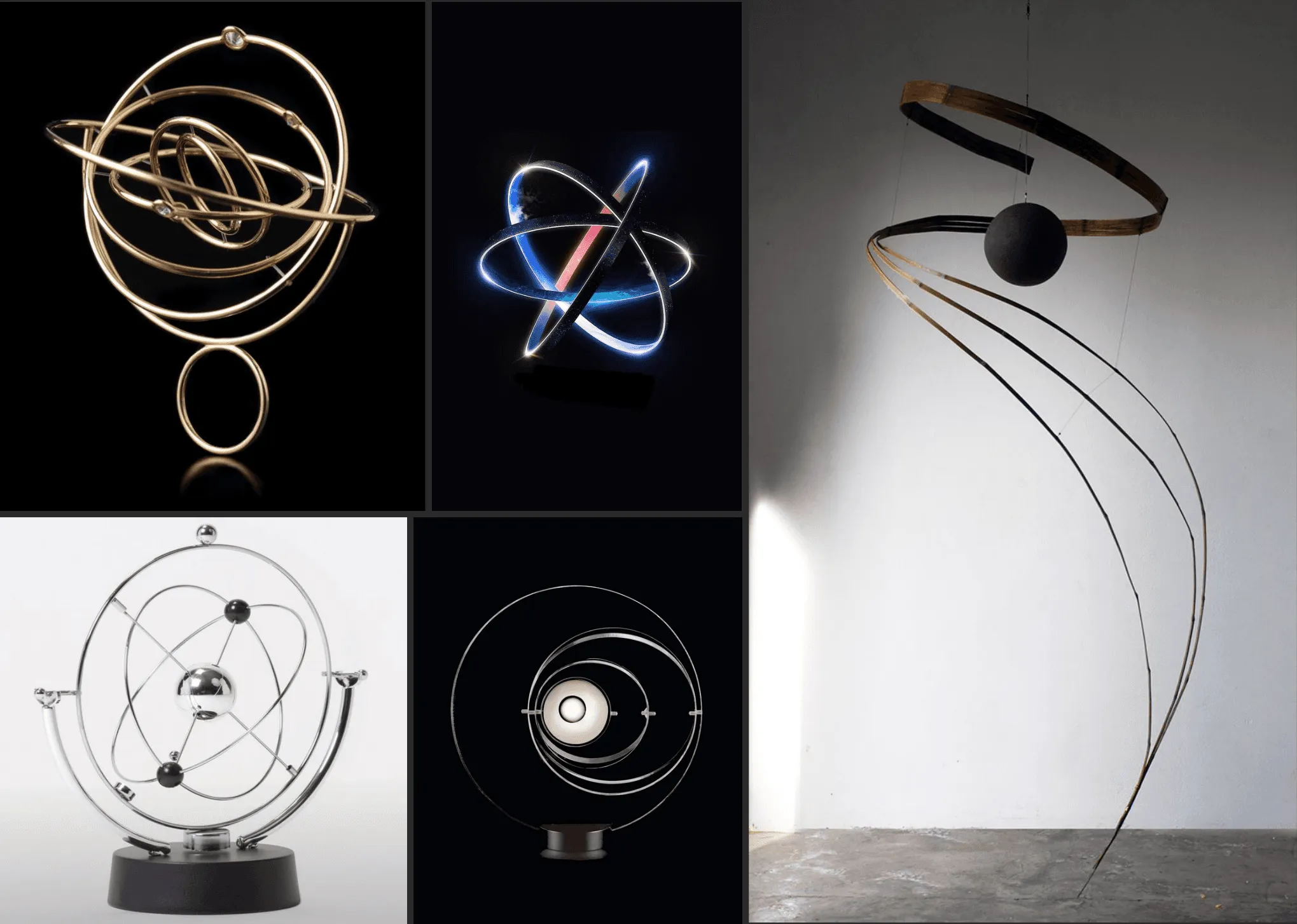
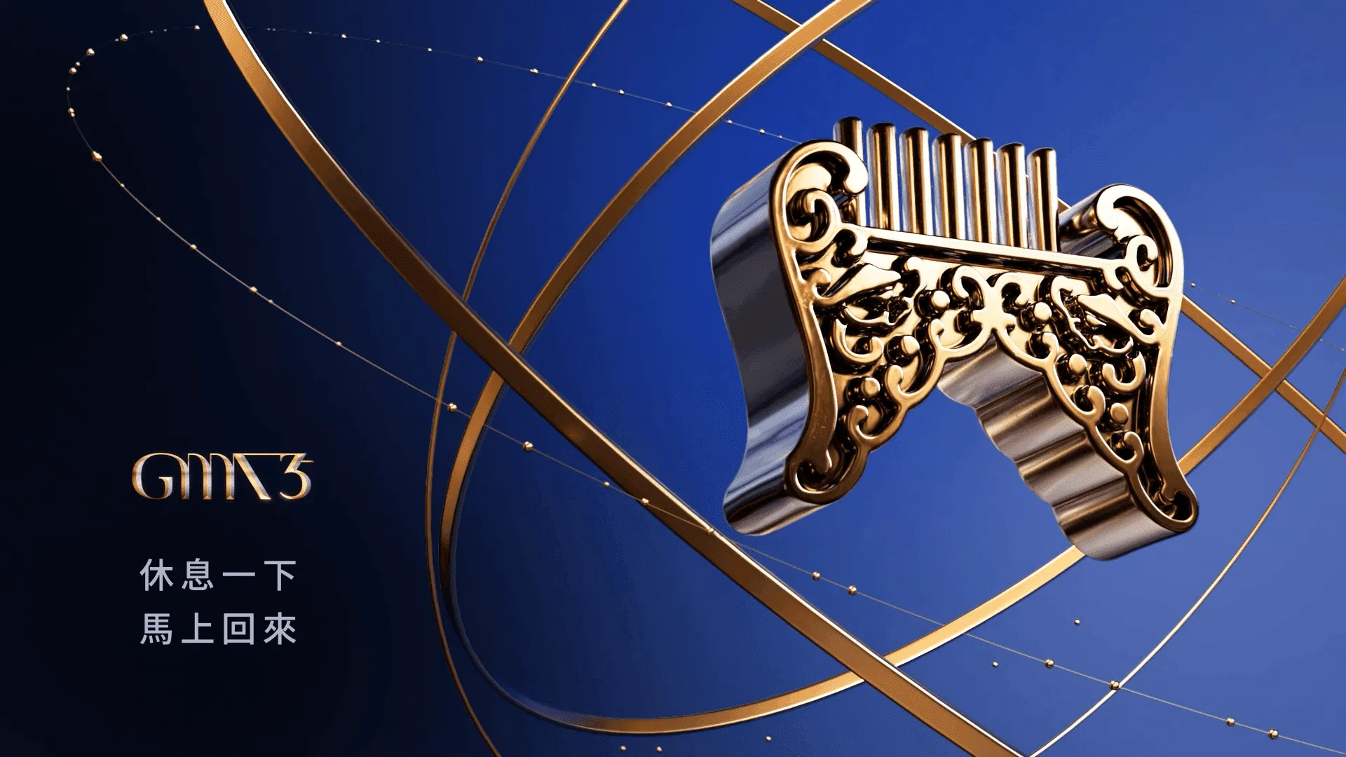
I joined mid-project as Art Director and quickly notice that there was no clear design guidelines, only broad ideas like “elegant,” “minimal,” and “high‑end.” The team had strong technical skills but no unified design vision. The client had already established the “armillary sphere” as the main theme, so my first task was to translate the theme into a core design language the team could follow and apply across every part of the ceremony, from stage design and broadcast packaging to nominee videos.
Concept
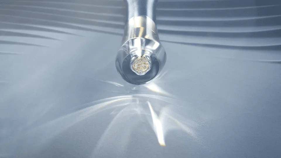
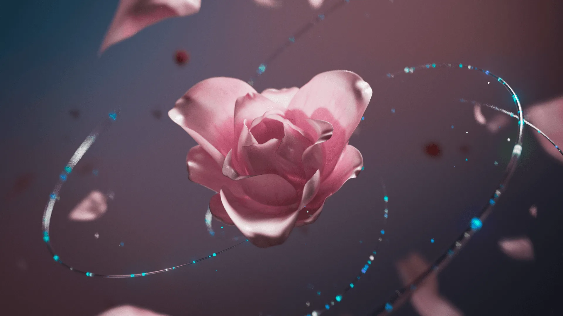
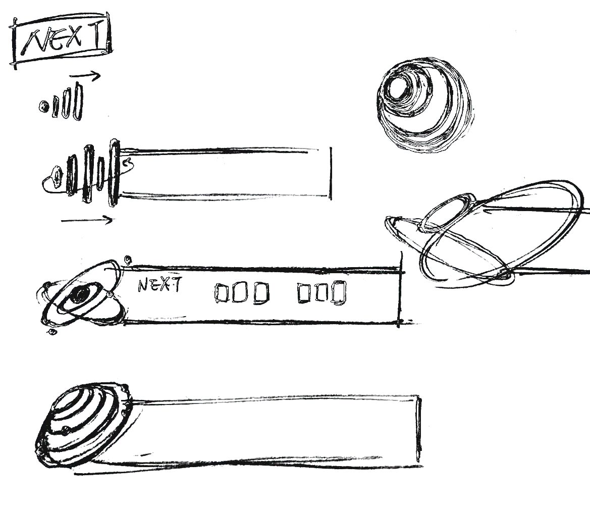
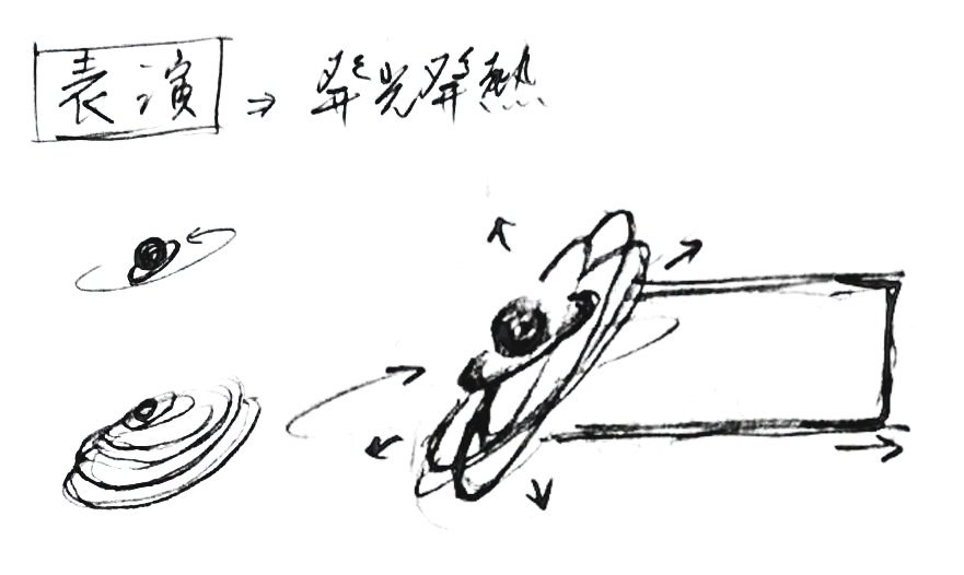
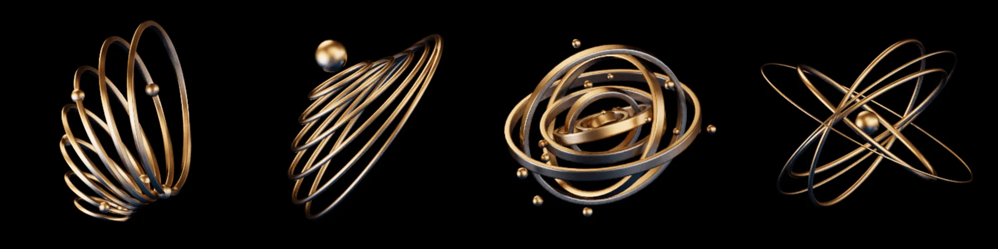
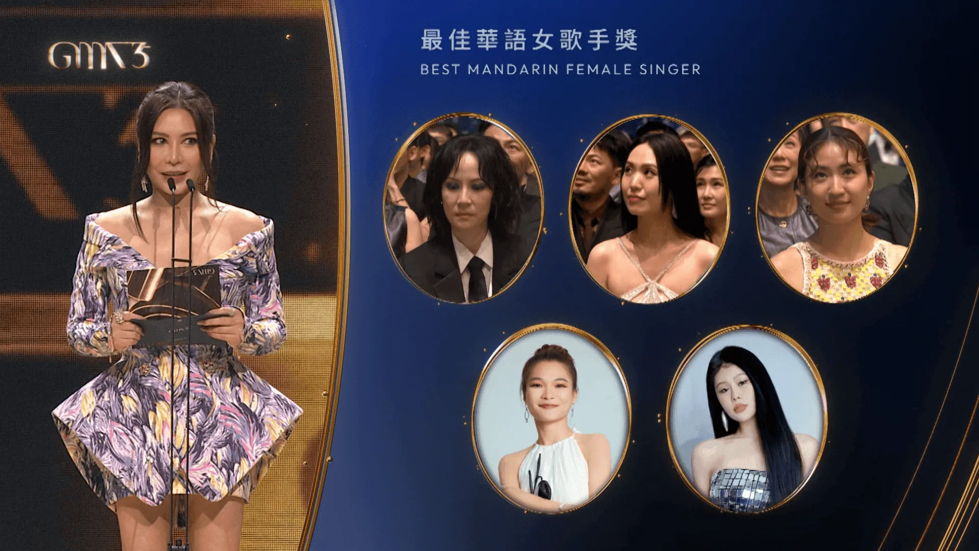
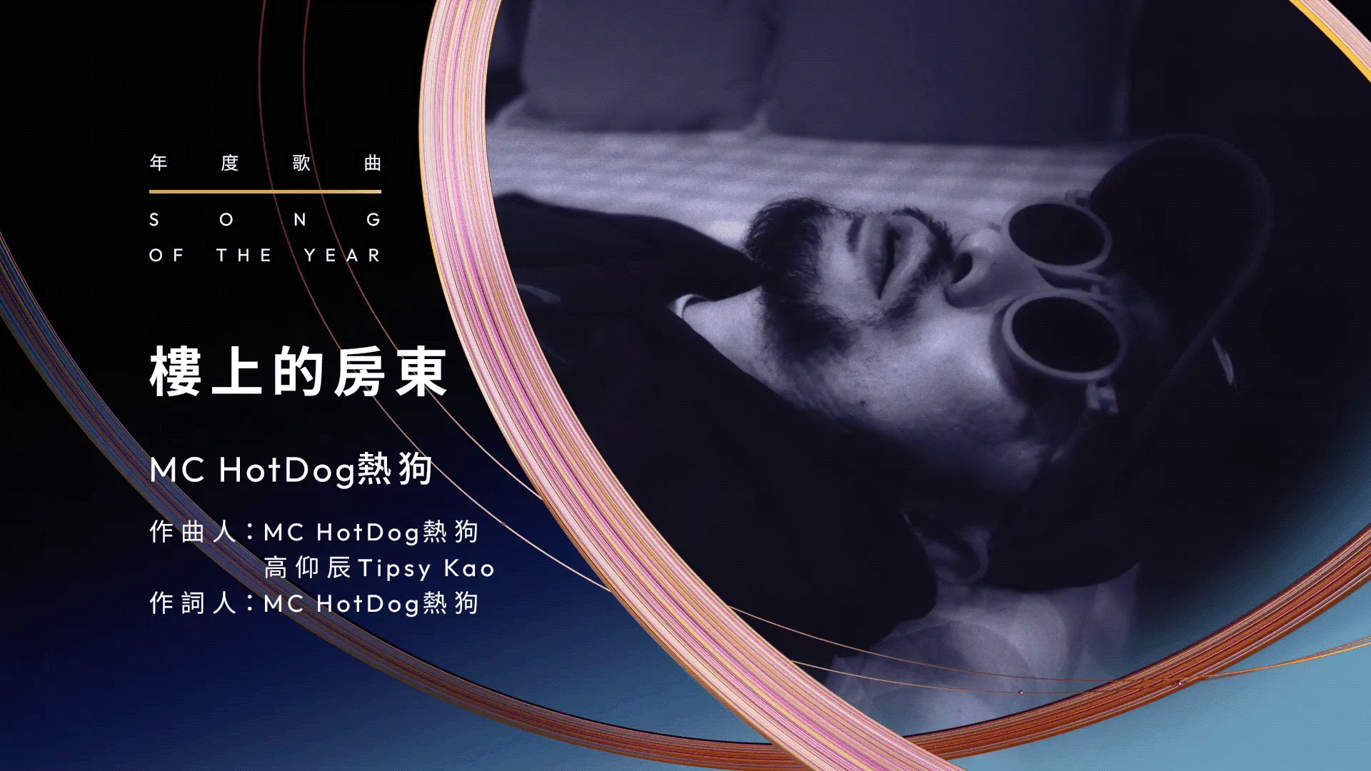
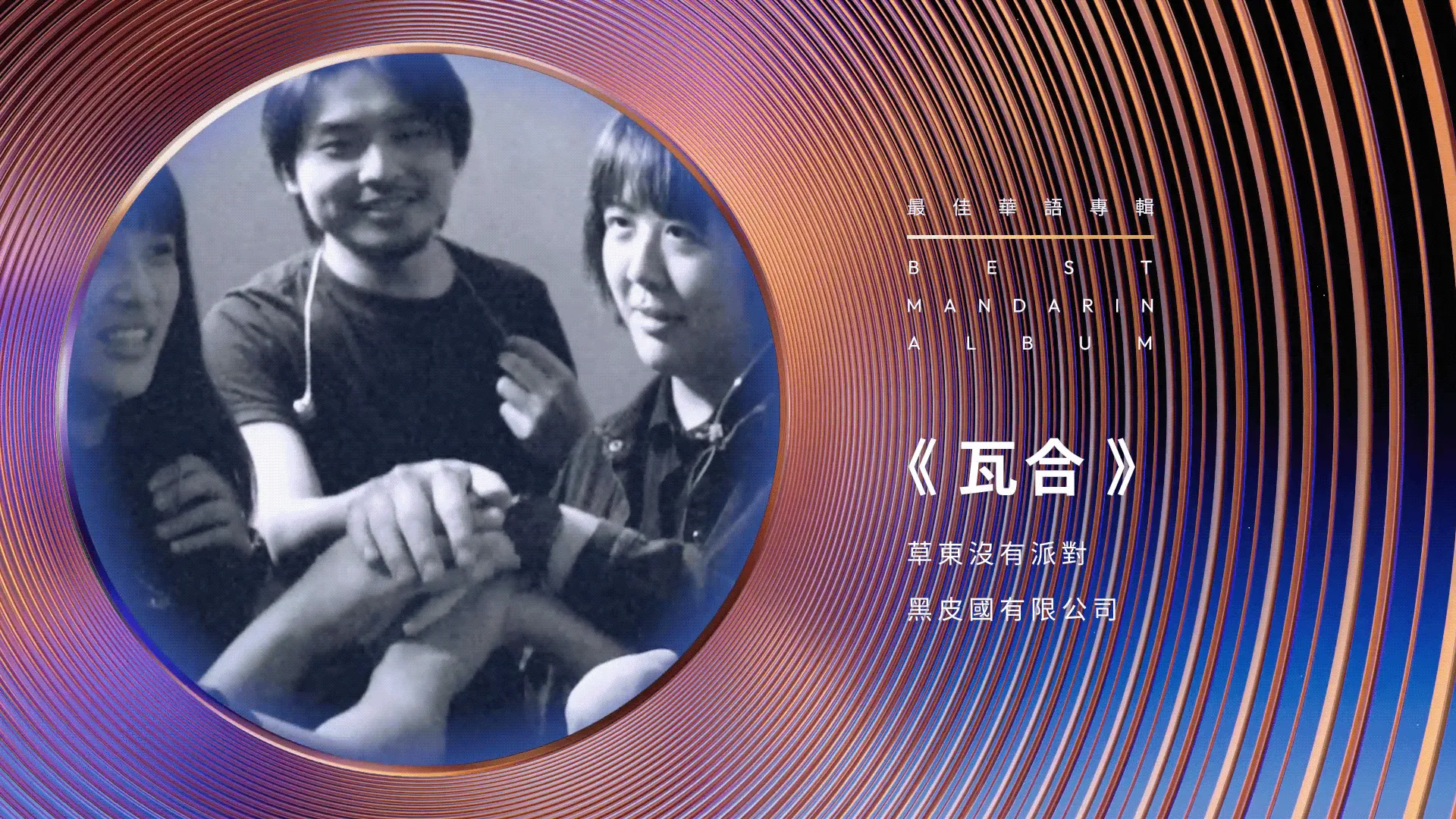
Inspired by the armillary sphere, we drew out the Ring as the core concept. The Golden Melody Awards is a gathering of the brightest talents, so we framed the ceremony as the gravitational center with artists orbiting as stars. The visual system uses rings, orbital paths, and layered eclipses, reinforcing the idea of the awards as the heart of the industry, surrounded by music’s leading stars.
Impact
The 35th Golden Melody Awards reached a remarkable scale both on television and digital platforms. The live broadcast and official streams together attracted over 10 million viewers worldwide, while social media channels generated millions more impressions and interactions across YouTube, Facebook, Instagram, and Weibo. These figures underscored the ceremony’s continued influence as the premier music event, often referred to as the “Grammy Awards of Asia.”
From a production standpoint, stepping in mid-project, I provided clear design guidelines that helped the team align quickly. By turning abstract adjectives into concrete checks, the team was able to evaluate work more efficiently, streamline collaboration, and deliver a cohesive visual system under tight timelines.
Situation when I joined mid-project
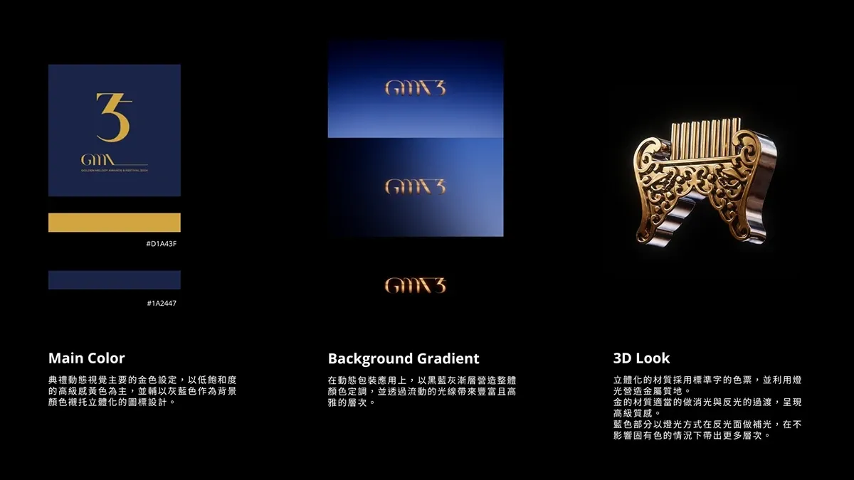
The logo and color scheme had already been set by the client.
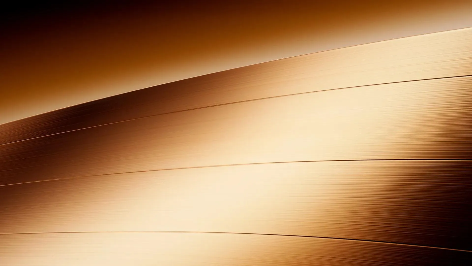
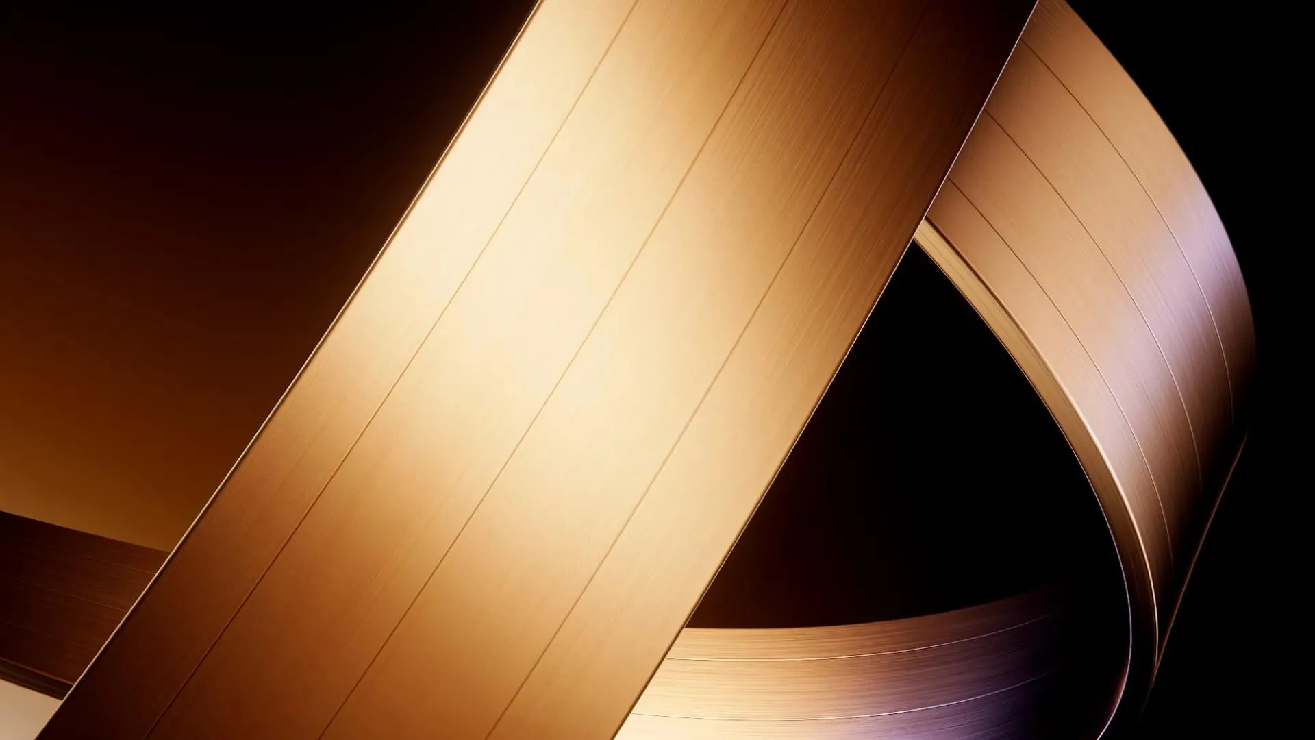
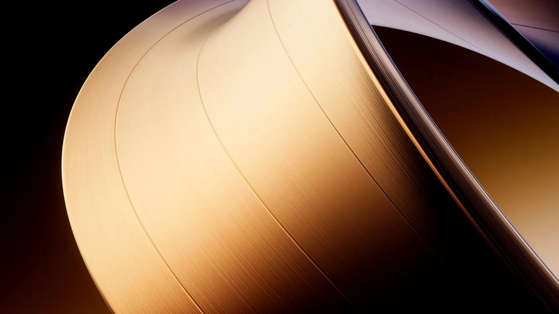
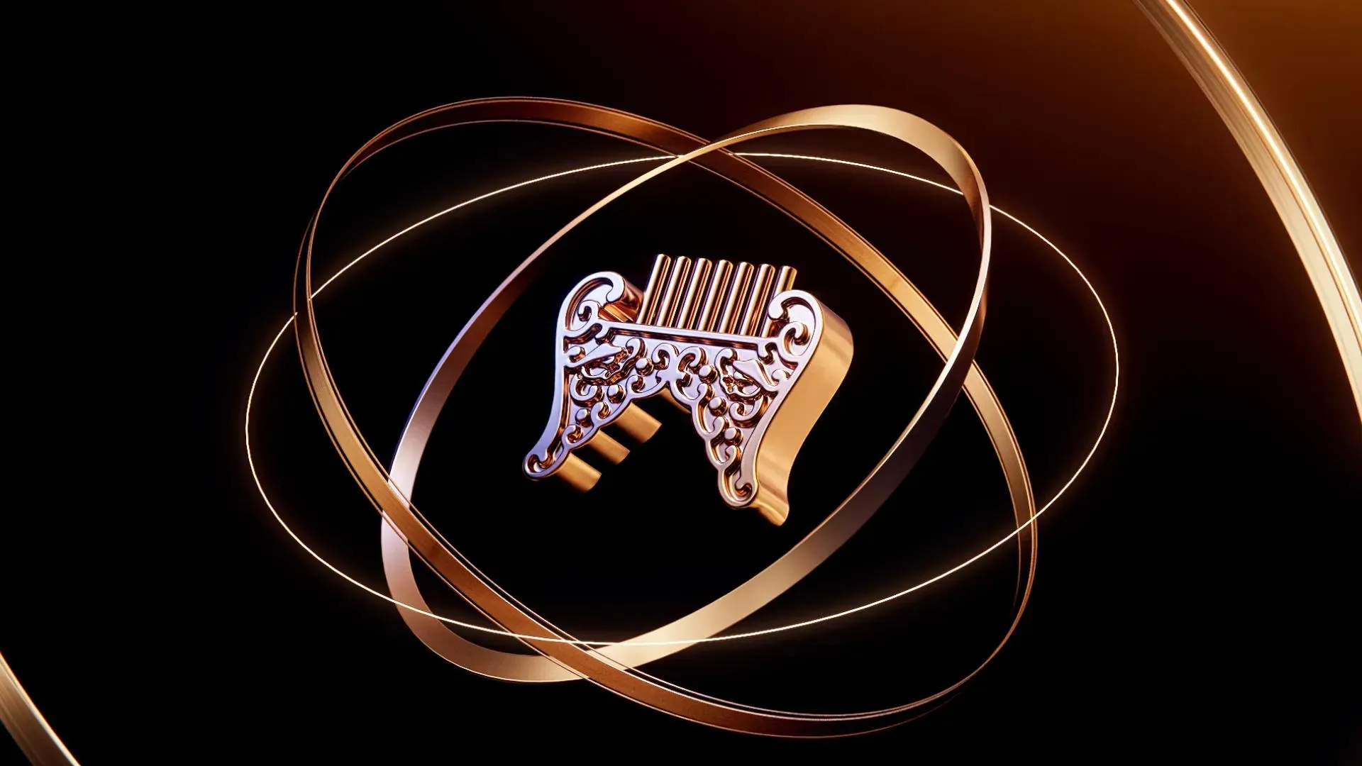
Early Design following the theme Armillary sphere, the issue is only had broad ideas like elegant, minimal, high-end.
Challenge
With limited time and existing work in place, my challenge was to avoid discarding progress and instead quickly define clear design guidelines.
The New Design Direction
with the qualities of orbit, ring, stars as main elements.
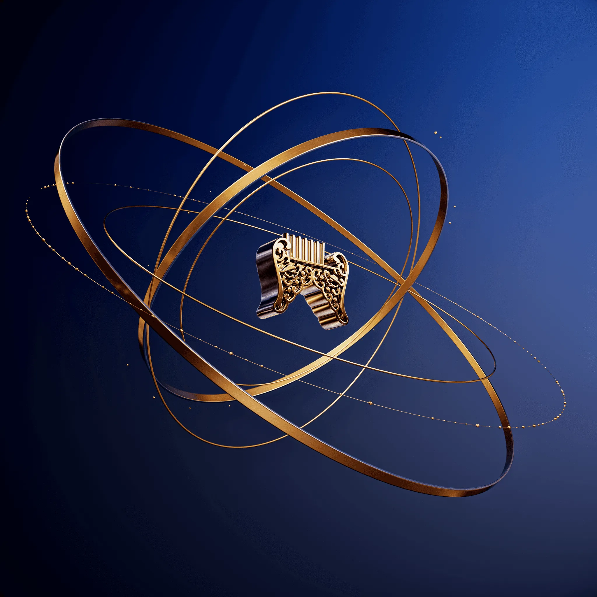
Early Motion Test
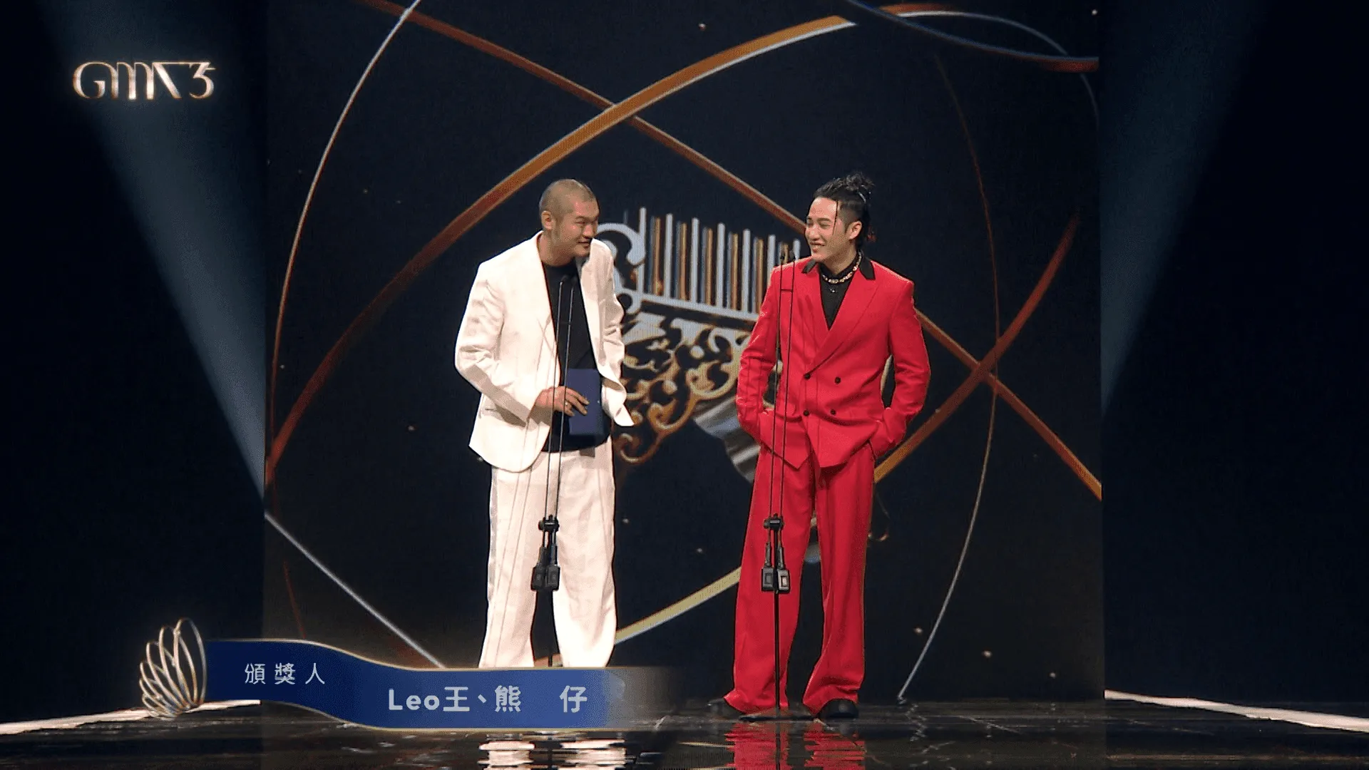
Lowerthird Design
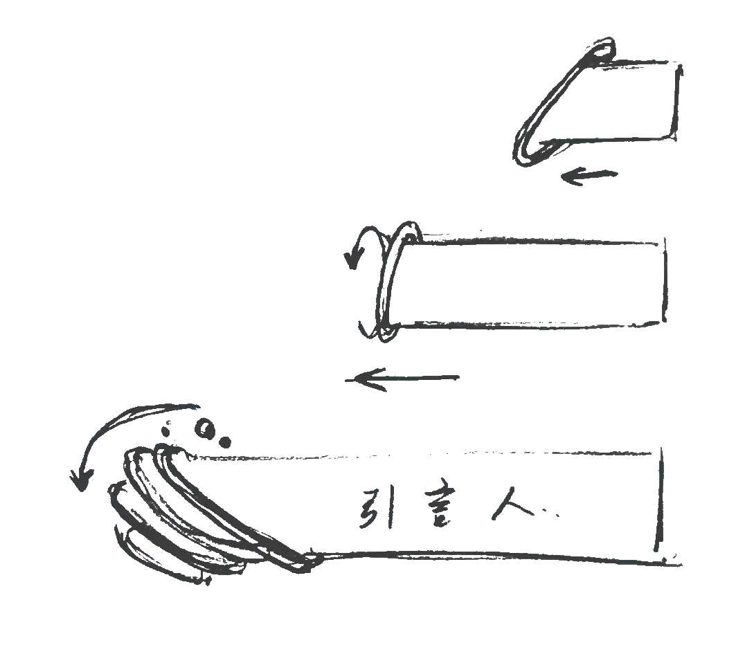
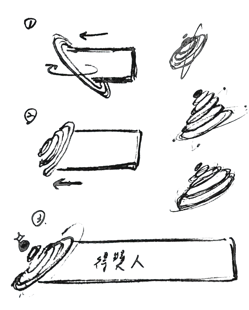
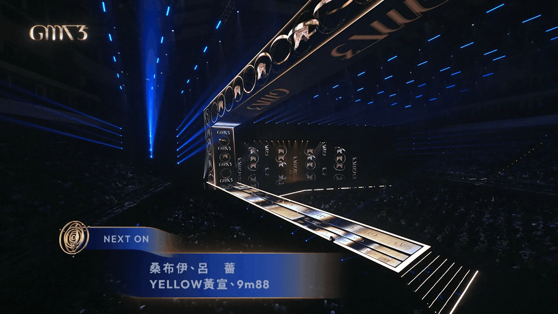
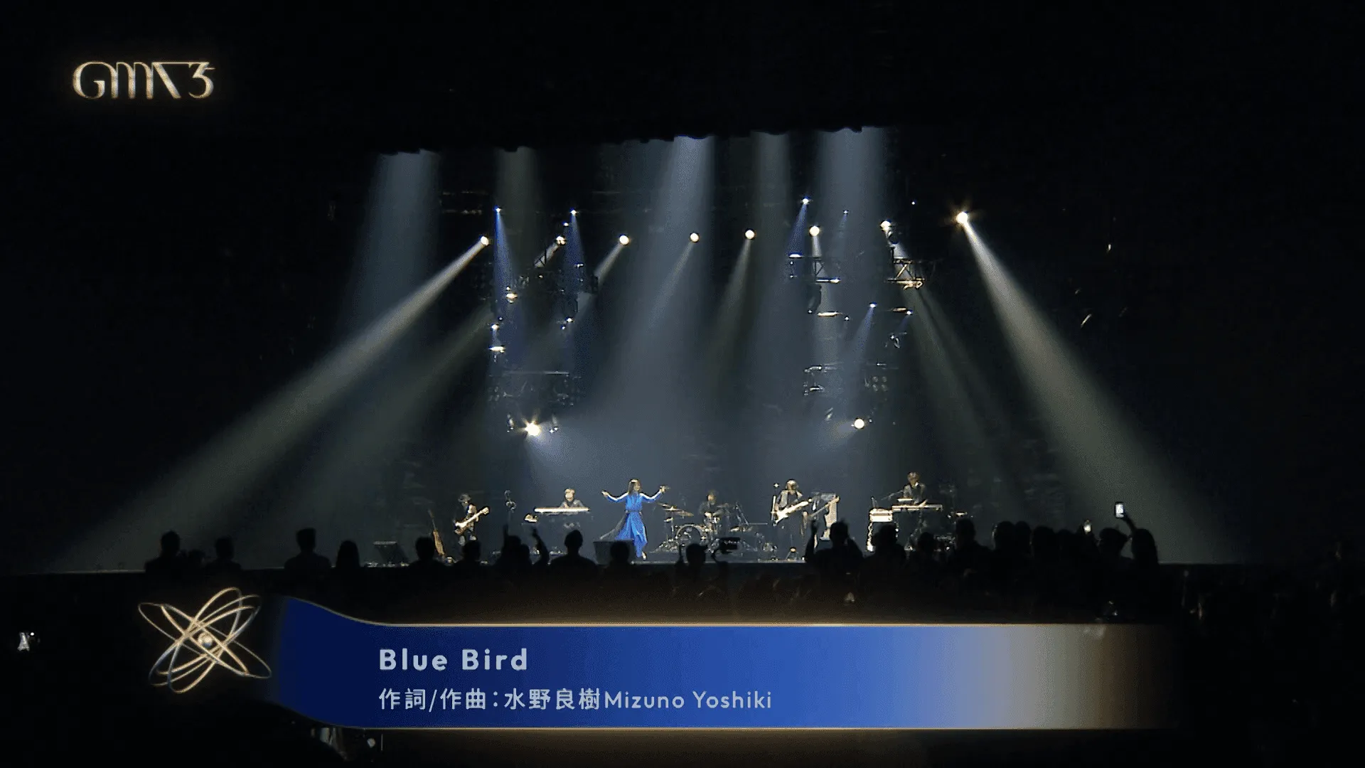
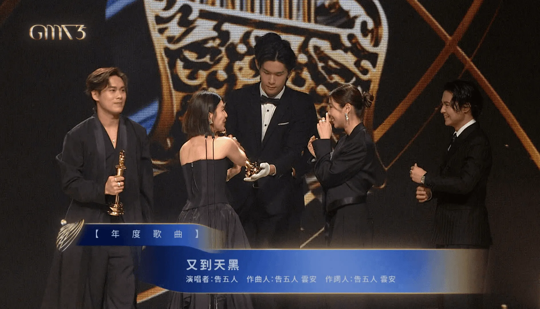
Sponsor & Info template
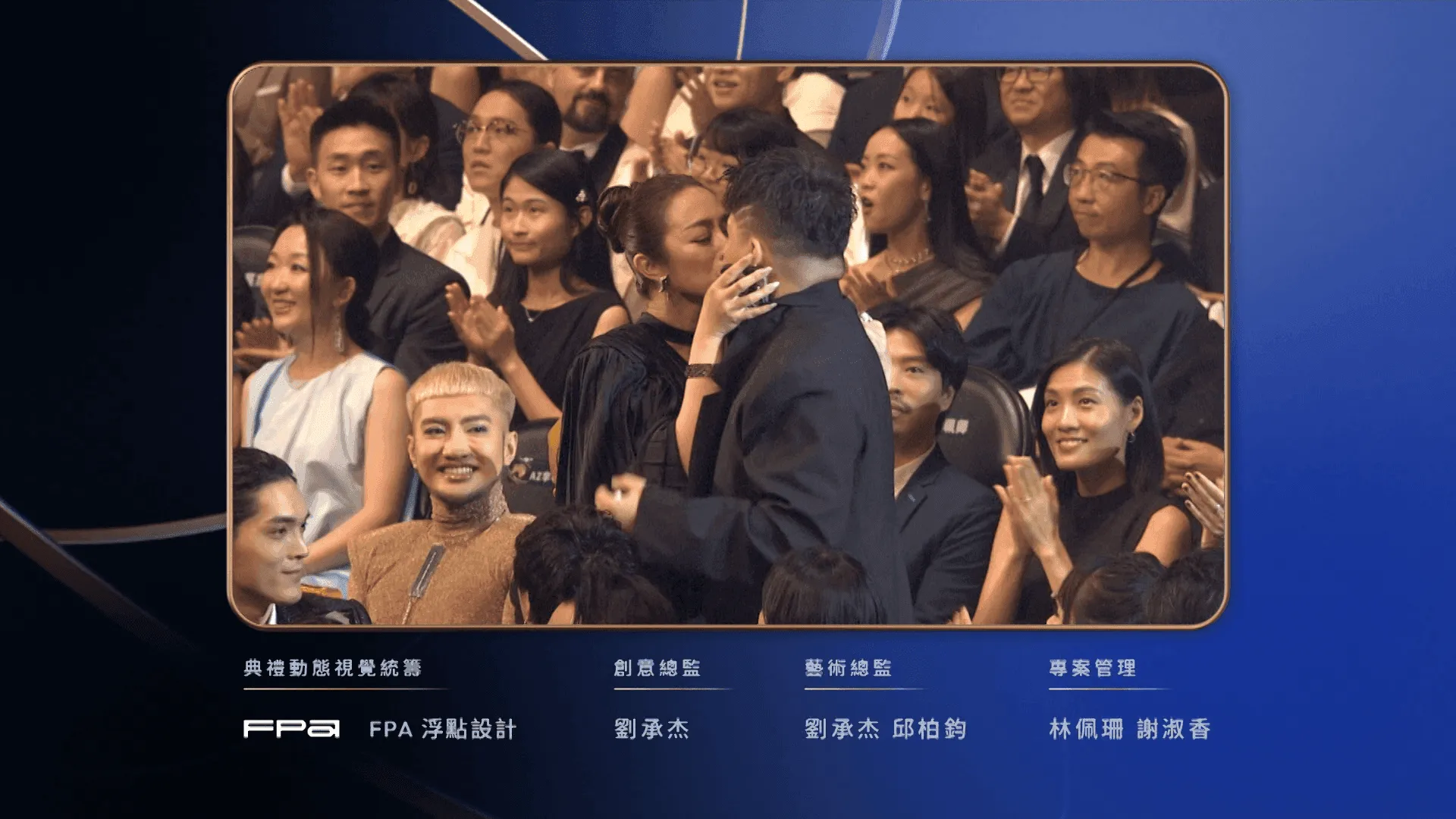
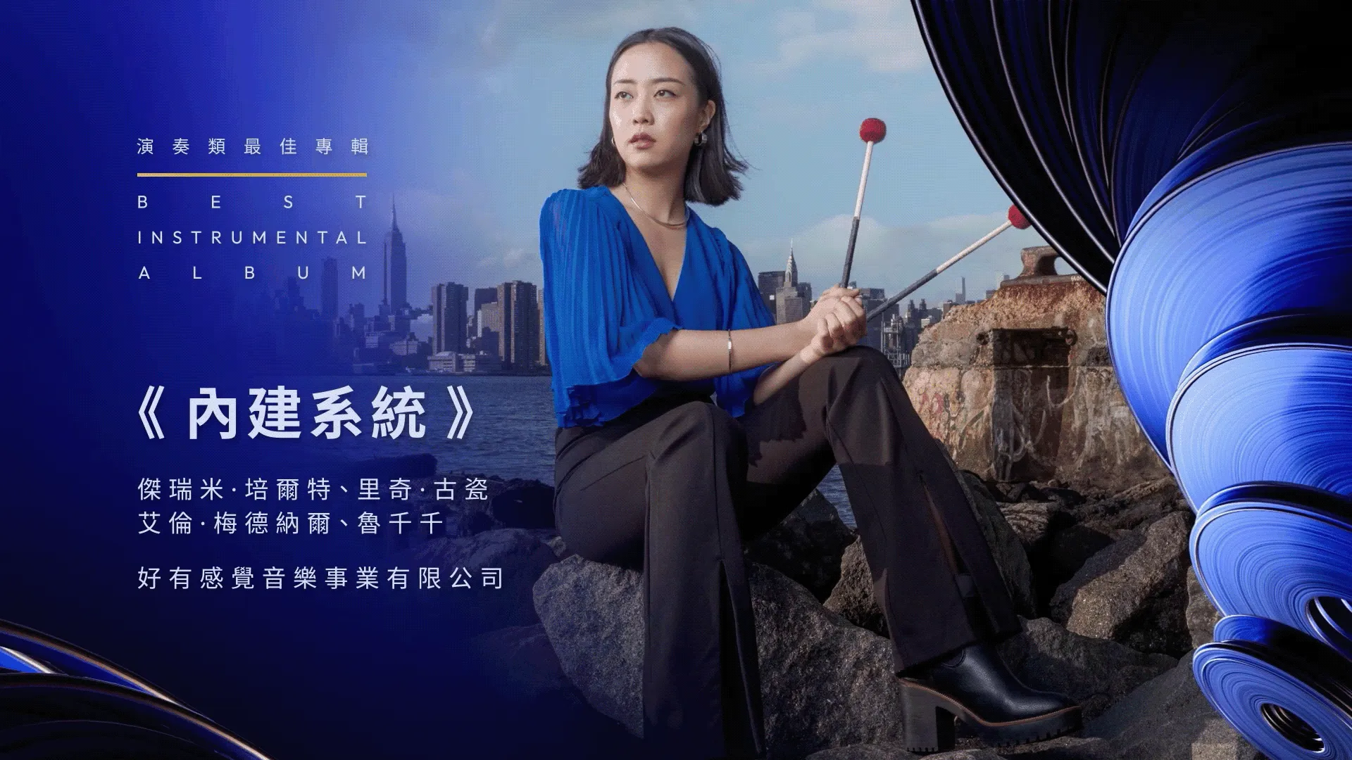
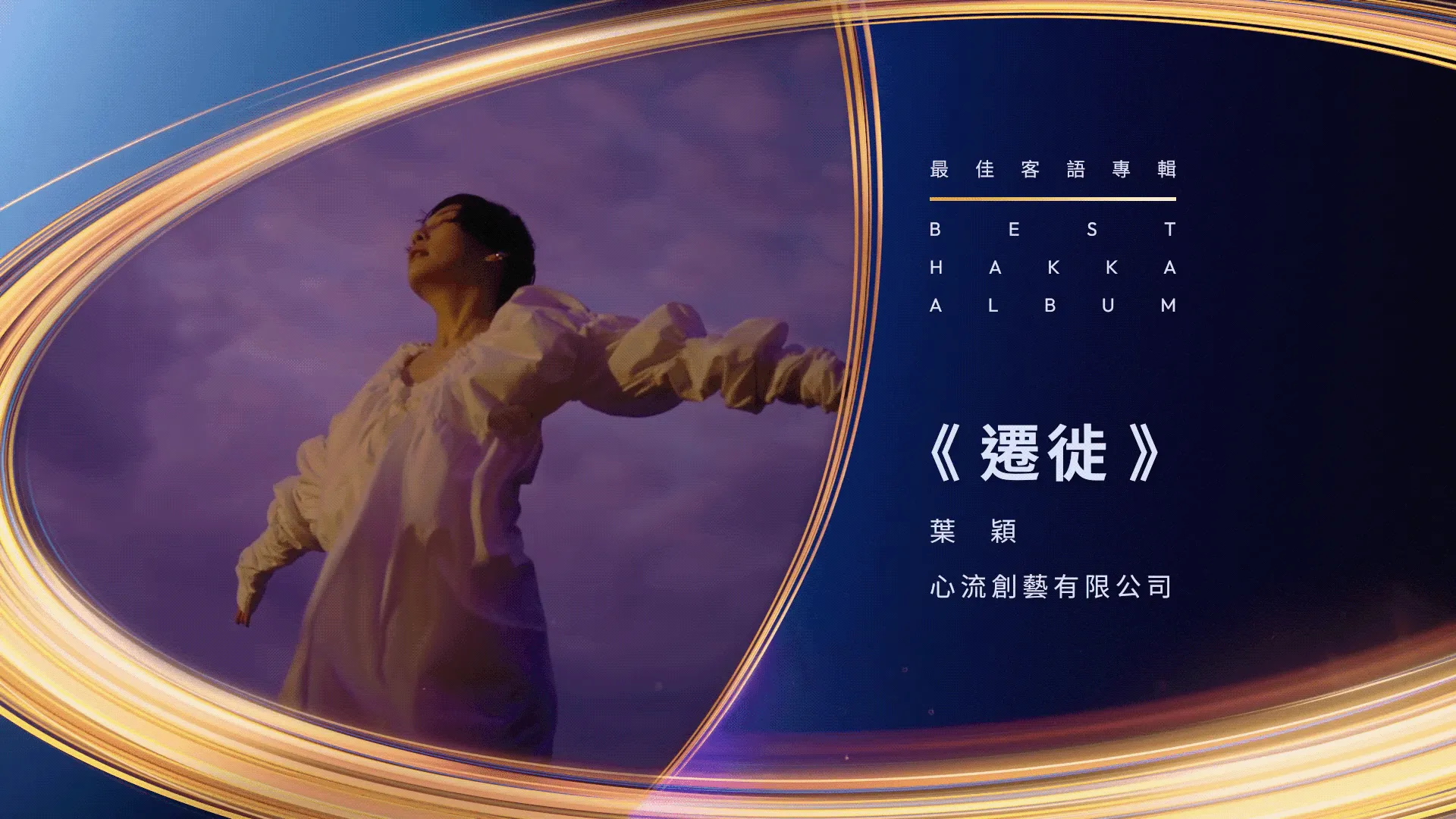
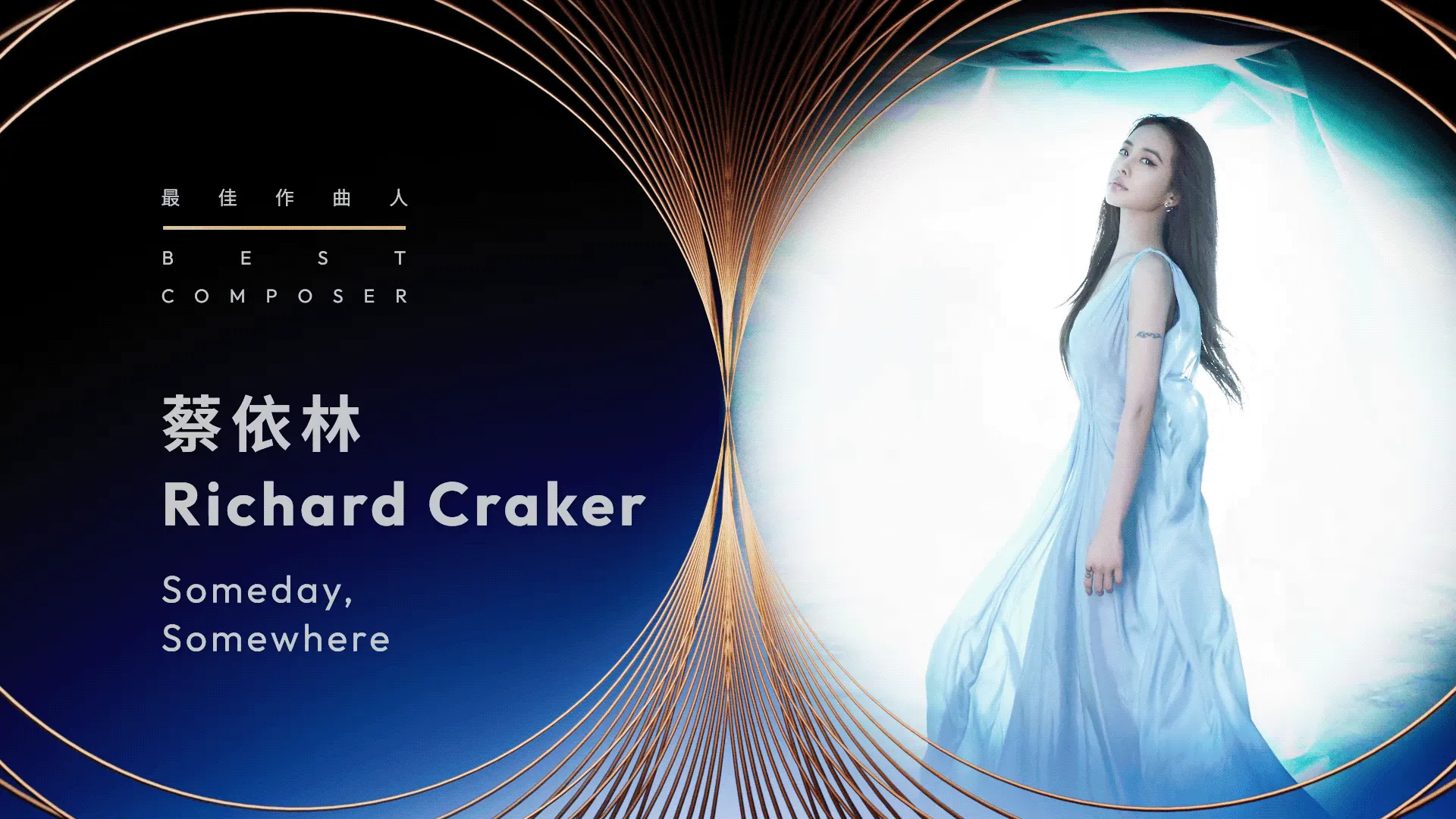
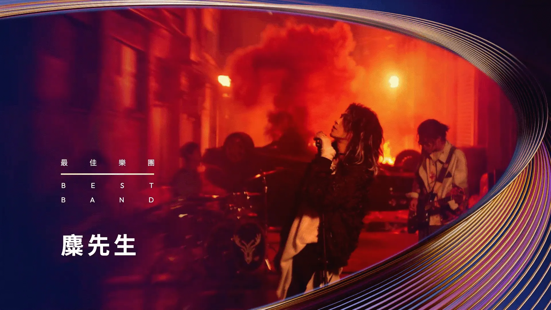
Nominee Video
CREDITS
- Client
- Ministry of Culture
- Production
- FPA (Floating Point Art) Studio
- Creative Director
- Cheng-Jie Liu
- Art Director
- Children Chiu, Cheng-Jie Liu
- Project Manager
- Pei-Shan Lin, Shu-Xiang Hsieh
- Award Motion Package Design
- Graphic Design
- Pei-Shan Lin, Kai-Jun Hsu, Zi-Ting Tseng
- Motion Design
- Yi-Hong Yue, Jia-Yu Jin, Jia-Zhen Hong, Yu-Sheng Chen, Qing-He Gao, Guang-Zhi Lu, Cheng-Jie Liu, Ting-An Chen
- Music
- Audio Textural — Chia-Wei Hsu
- Nominee Video Production
- FPA (Floating Point Art), COMPUTERFACE, YAGA STUDIO